
The Project
Due to my obsession with cats and a longing to visit a cat cafe, when I was tasked with making a logo for a restaurant, I knew exactly what I wanted to do, and thus, Calico Cafe was born!
Calico Cafe is a cat cafe located in Orlando, Florida in close proximity to the University of Central Florida. They partner with local shelters and house homeless cats at risk of euthanasia in their cafe. They care for their cats and kittens until they can be adopted. Their mission is to reduce euthanasia rates by helping find loving homes for their rescued cafe cats. Calico cafe has yummy food and coffee and a very chill atmosphere.
Creative Brief
Creative Brief and Mood Board for Calico Cafe Logo Project:
- A logo that is both creative and simplistic and that also represents and matches their company well.
- Owner, Catherine Claw wants the tone to be playful but not chaotic.
- Logo should appeal to their main customer demographic, female teens and adults aged 16-24, students at the University of Central Florida.

The Creative Process Begins…

When starting on the project I had many different ideas. I started out by putting pencil to paper and sketching out all of the different ideas I had. This helped me narrow down which ideas i thought would be best for the project. I really liked logo #8 and decided to move forward with it for the project!
When I got to Illustrator, I began by shaping out the main components for the logo, the cat and the mug. I messed around with the shape of the cat, the pointedness of its ears, different facial expressions, mug thickness, etc. The creative process can be very messy!
Getting further along, I started to figure out the details and come up with options for the logo so I could decide which elements looked best.

Narrowing it down…
I started to get closer to finalizing the logo, only a few more decisions left to be made. I had a few different options to choose from including: the eyes, the nose color, word placement, and I wasn’t quite sure what shade of green I wanted to use.


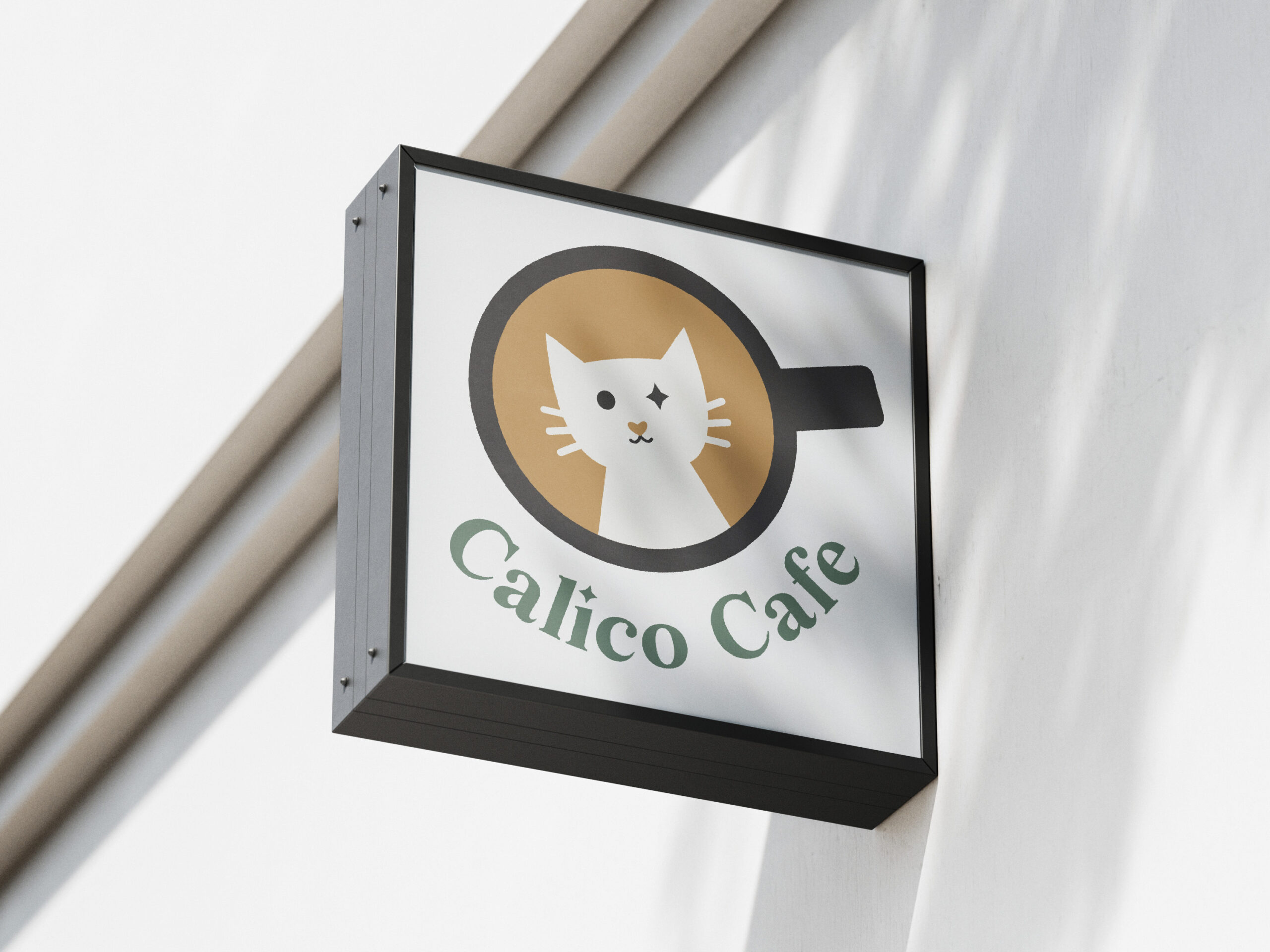
The Final Logo

Ta Da!
Here is the finished product. I was really happy with the way this logo turned out and I think it achieved the goals of the creative brief quite nicely!